Case Study: Hamilton Kaye Integrated Condo Management Branding & Design
BRANDING & CREATIVE MARKETING
Client: Hamilton Kaye Integrated Condo Management Inc.
Industry: Property management
My Role: Graphic designer
Deliverables: Responsive brand identity system: primary logo, secondary logo, typography, colour palette and brand pattern and brand applications such as stationery and social media animations.
Date: May 2026
The Client's Problem
The client is an up and coming property management company that specializes in overseeing condo properties in the Brampton area. They wanted a fresh, modern and unique brand design that would help them stand out from their competitors, while also remaining professional and approachable. They needed to build their credibility with tenants, property owners, and board members with the right visual identity.
Project Objectives
• Build trust
• Stand out from competitors
• Create a flexible, modern identity
• Ensure consistency across all applications
Where We Landed

The logo animation of the primary vertical logo for Hamilton Kaye Integrated Management.
So, What Was I Thinking?
Logo Breakdown

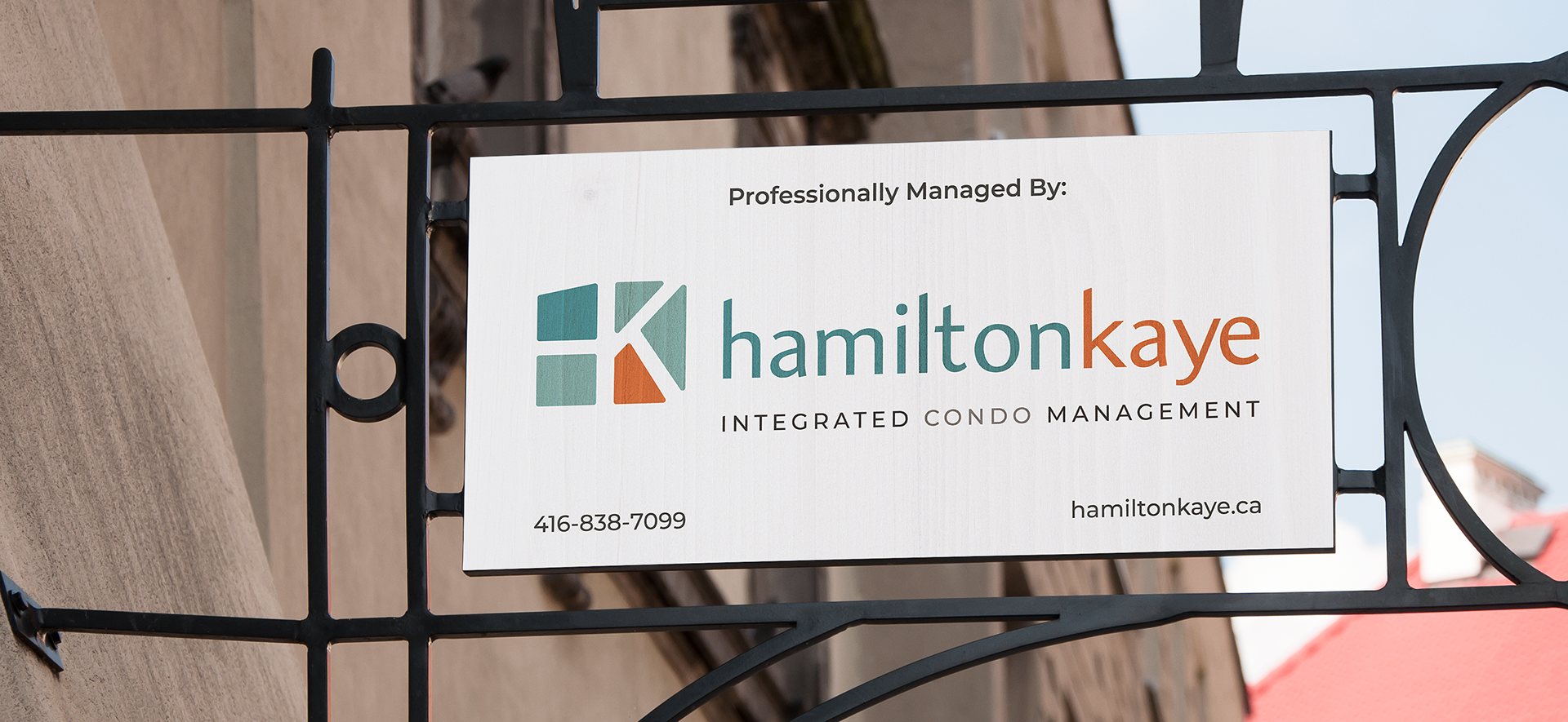

The "CONDO" appears in a different colour as it is not the official name of the business, but it is a large part of their clientele. This allows for the business to include other types of properties in the future without having to redesign their logo.
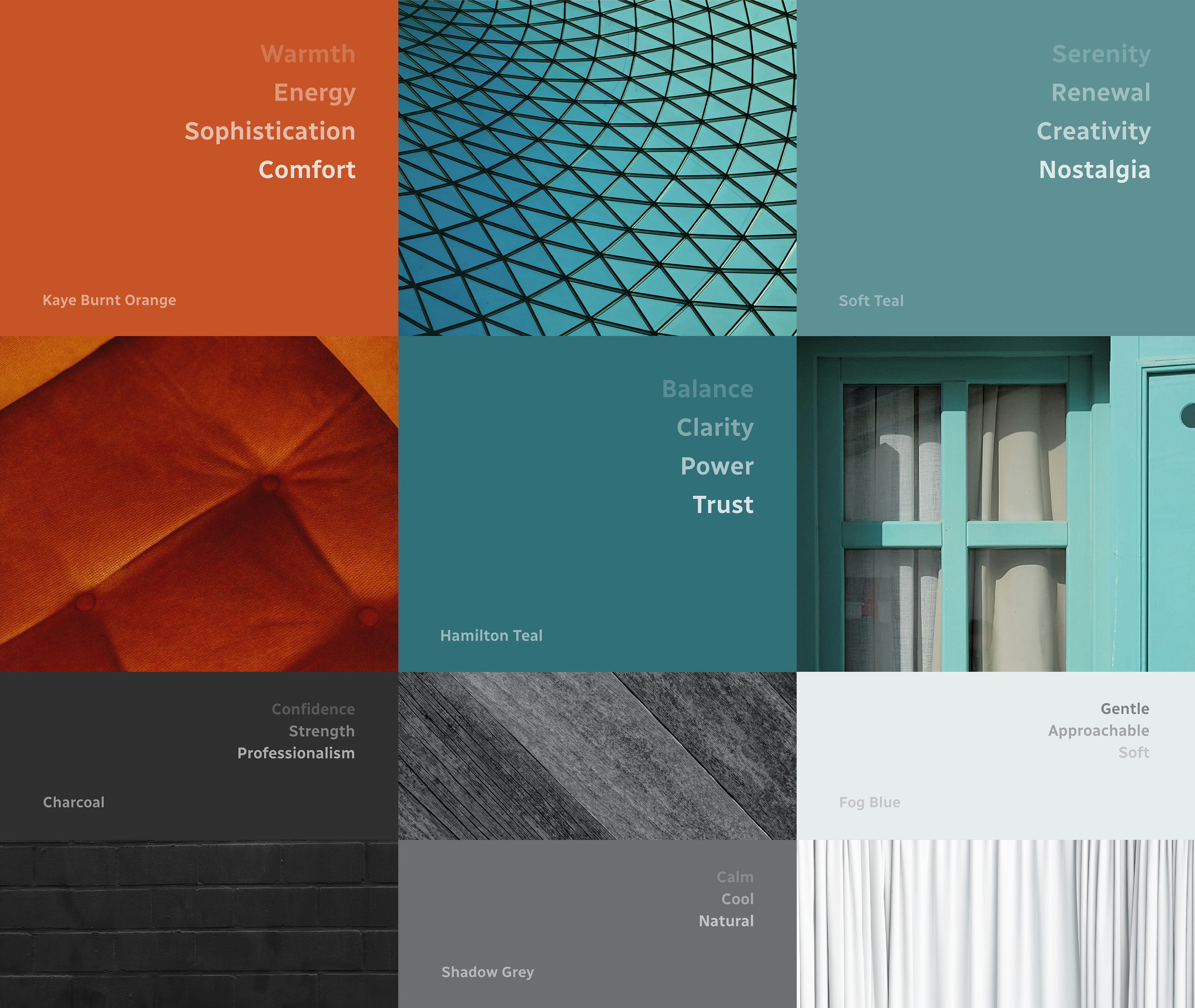
A Comforting Colour Palette
An Energizing Brand Pattern


The Hamilton Kaye Brand in Action